Company Website Redesign

Client
-
Services
Web Design, Landing Page
Timeline
1 Days
Year
2026
Company Website Redesign – UX/UI Case Study
1. Discover – Understanding the Problem
The original company website had good content but the overall user experience was not effective. Users faced difficulty in finding important information because of unclear navigation, crowded layouts, poor spacing, and weak call-to-action placement. The visual hierarchy was not well defined, making it hard for users to understand what to do next.
Problems Identified:
Navigation was confusing
Pages felt cluttered
Important buttons were not visible
Text was hard to scan
Goal:
Improve user interaction, clarity, and usability while keeping the original brand identity.
2. Ideate – Exploring Concepts
After reviewing the original website screenshots, several ideas were explored:
Simplifying the menu structure
Creating clear visual sections
Improving typography and spacing
The focus was to make the website cleaner, easier to navigate, and more engaging.
3. Design – Bringing the Concept to Life
The website was redesigned using the original screens as reference. Key pages such as the Home Page, About Page, Services Page, and Contact Page were recreated with:
Better alignment and spacing
Clear headings and readable fonts
Strong visual hierarchy
More visible call-to-action buttons
The new design maintains the brand style but improves usability and user flow.
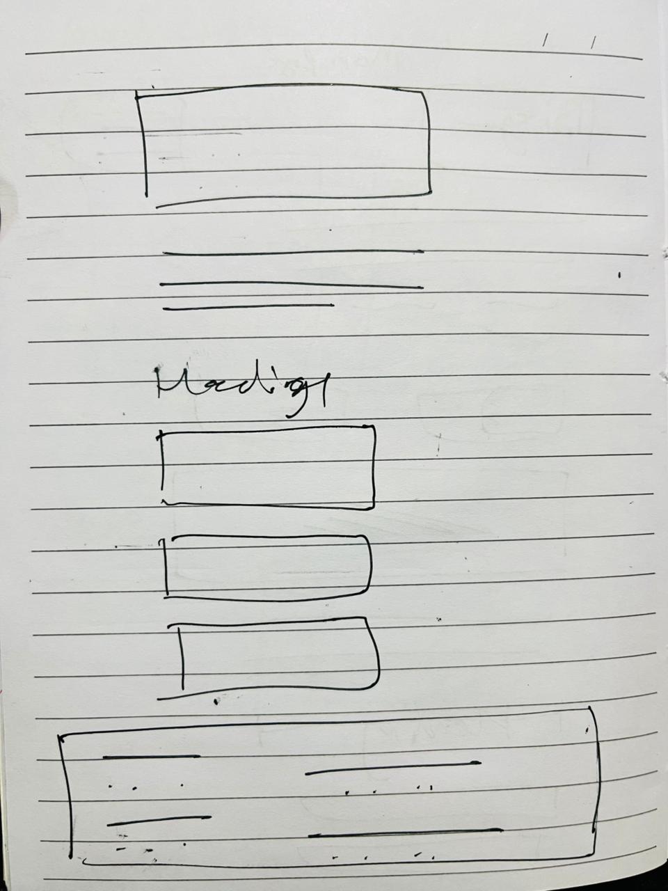
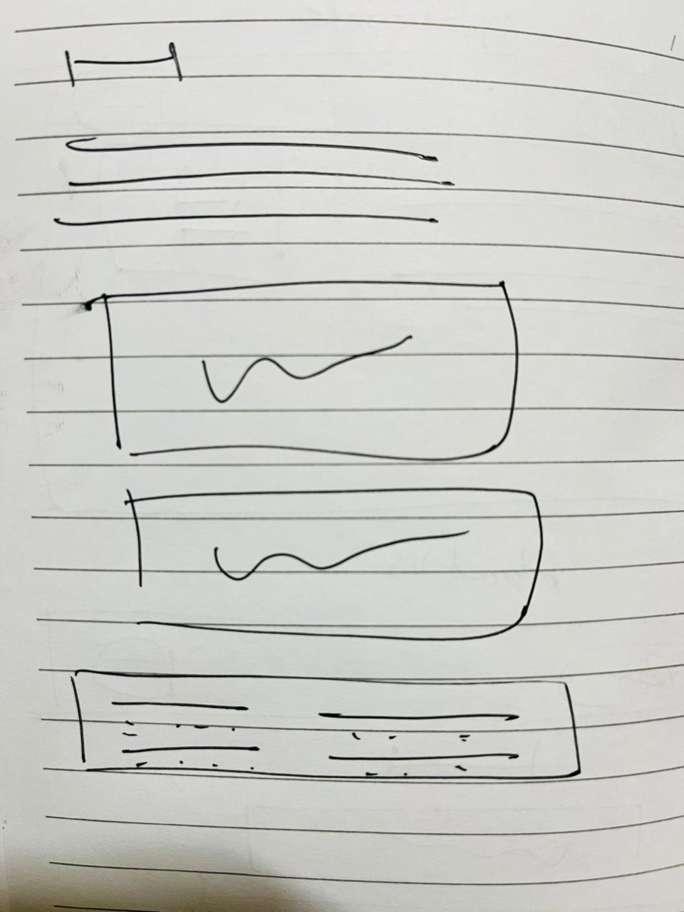
Wireframing
Before creating the final UI, wireframes were built to plan the layout and structure.
Main Page
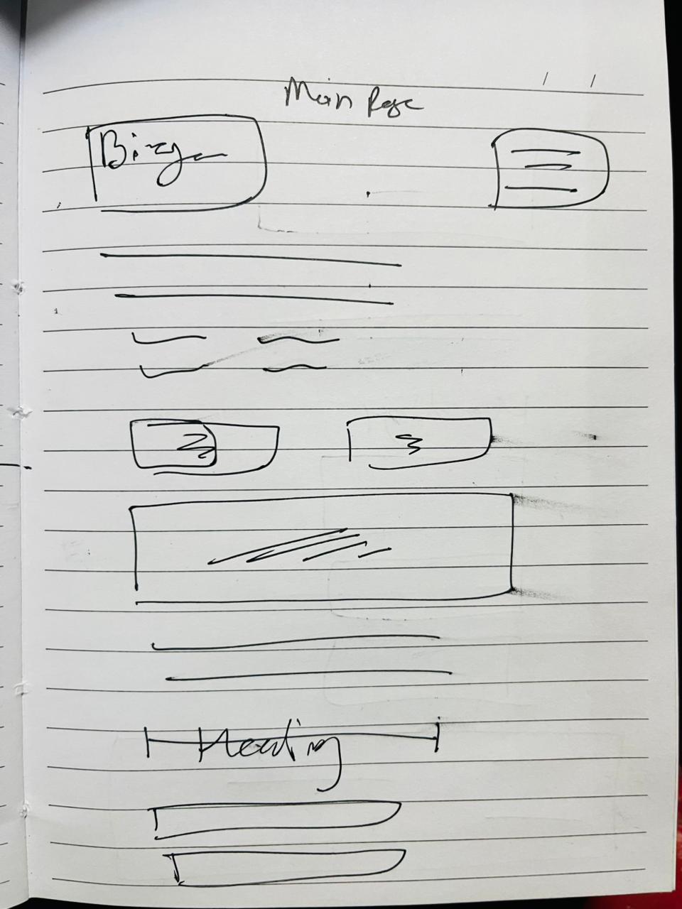
Option Button
About Us
Figma Screen List
Design these as separate frames in Figma:
Home / Hero Screen
Logo & brand name
Hamburger menu
Hero heading
Sub-text
Primary CTA → Get Started
Secondary CTA → Our Work
Product ecosystem image
Intro company paragraph
Why Clients Choose Us
Title
KPI cards
2K+ Successful Implementations
14+ Years Experience
90% Happy Clients
India map (client presence)
Client list & description
Products & Services
Split into cards:
Software Products
Hardware Products
Website & Digital Marketing
Each card contains bullet list of services.
Other Products
Admission system
Payment gateway
Grievance portal
Exam system
Bulk SMS
Footer / Contact
Quick links
Site links
Address
Phone
Email
Copyright
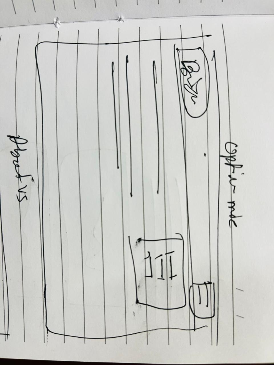
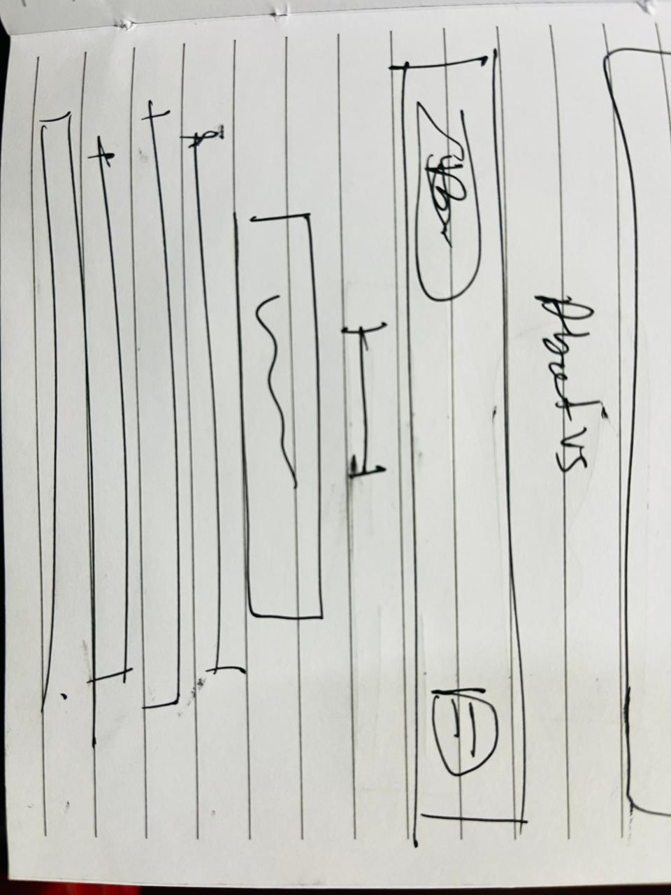
Mobile Menu (Overlay)
Home
About Us
Products
Close (X)
Color Palette
Purpose | Color | Hex |
|---|---|---|
Primary Background | Deep Navy Blue |
|
Secondary Background | Gradient Blue |
|
Card Background | Glass Dark Blue |
|
Headings | White |
|
Body Text | Light Grey |
|
Accent Blue | Electric Blue |
|
Accent Green (CTA) | Bright Green |
|
Highlight Orange | Orange |
|
Divider / Lines | Soft Blue Grey |
|
UI Kit
Typography
Usage | Font |
|---|---|
Headings | Poppins / Inter (Bold) |
Buttons
Type | Style |
|---|---|
Primary | Green bg |
Secondary | Blue bg |
Cards
Dark glass style
Gradient border
Soft inner shadow
Padding: 20–24px
Rounded corners: 16px
Navigation
Hamburger menu
Slide-down white menu
Rounded menu panel
Highlights
Numbers (2K+, 14+, 90%) → white bold
Label → light grey
7. Test & Refine – Perfecting the Details
The design was reviewed by checking:
Can users find information easily?
Are buttons clear and visible?
Is the layout simple to understand?
8. Deliver – Handing Off the Design
The final UI was delivered with:
Organized Figma files
Reusable components
Consistent color and typography styles
This makes the design easy for developers to implement.
Conclusion
The redesigned company website improves user interaction by making the interface cleaner, more structured, and easier to navigate. By enhancing visual hierarchy, spacing, and call-to-action placement, the website now provides a smoother and more professional user experience while staying true to the company’s brand identity.

